Looking at stock volatility
July 27, 2022
US equity markets drifted lower over the session, with the SPX finishing -1.15% in the red, the DJIA -0.71% and the NDX -1.96%. The SPX broke the important 3950 support during the session and closed at 3921.
Implied volatility moved higher throughout the session but seemed to struggle towards the close. Below we have a chart of the 30d implied volatility index for the SPX.
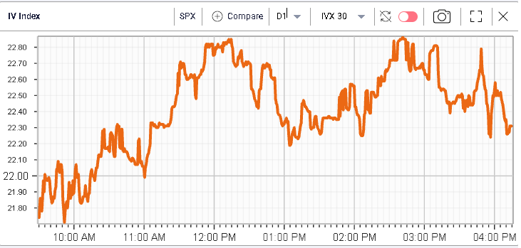
As the market is about to get very macro driven with the FOMC meeting today, we will discuss single stocks volatility in this market update.
First, let us look at the DJIA components. In the below table from the Stock Monitor in IVolLive, we sort stocks by IVP30, the measure that allows us to quickly identify whether the last IVX30 value is high or low compared to the stock’s own history.
For instance, in WMT, we can see that the IVP30 is currently in the 98th percentile which means that only 2% of the time was the IVX30 higher than where it is now (30.05) for the stock.
This measure is useful to compare implied volatility of various names using an objective metric which is simply the stock’s own history.

Another useful measure is to look at the difference between the implied volatility index (IVX) and the historical volatility which measures the latest observed volatility in the market. For instance, we can see that for VZ, the HV20 is 30.31 while the IVX30 is 21.9. The difference between the two is 8.41.
Looking at the below chart, we plot that exact difference using Charts (within IVolLive) over the past 5 years.
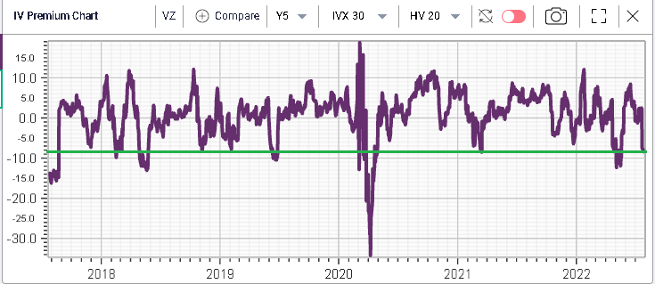
We can see that the difference of -8.41 is quite low historically as shown by the green line. It also seems that this difference moves between -10 and +10 and that can help us understand if opportunities exist in the market.
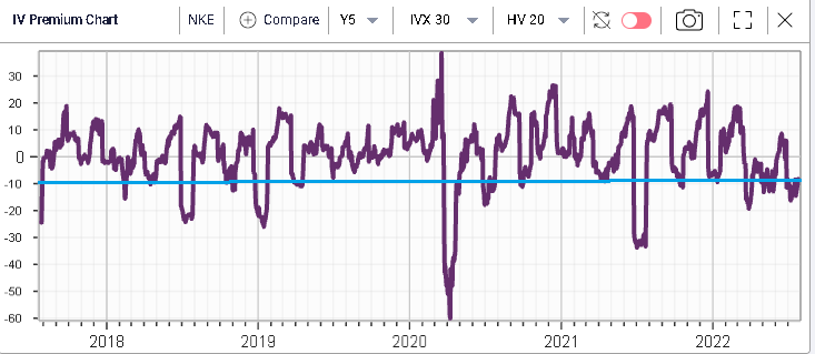
NKE is another example of implied volatility looking historically lower vs realized volatility.
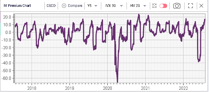
On the other end, we find names like CSCO and INTC shown below where implied volatility is currently at a significant premium to historical volatility.
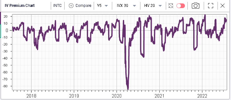
This type of metric is very important for traders who have completed their pre-trade analysis and identified names where they want to express a bullish or a bearish view. This allows for a quick back of the envelope opinion on volatility and can then be of substantial help to identify specific structures to express those views.
For instance, traders would tend to focus on spreads when volatility looks elevated and at outright option plays when volatility looks low so it is something that you need to bear in mind.
Want more information? Visit our Youtube channel: https://www.youtube.com/c/IVolatility%E2%80%99sYouTube